
Design Stunning Power BI Reports Users Love in just 14 Days
Amaze your stakeholders and get noticed by building modern, user-friendly Power BI reports using a proven UX/UI design system.
CLICK BELOW TO WATCH FIRST


⭐⭐⭐⭐⭐
Absolutely Amazing
"I would say its the highest level of design one could get to."
- Carlton S.

⭐⭐⭐⭐⭐
UX/ UI Design Must Have Course
"I needed a design process and his course provides that in so many ways."
- Abe D.

⭐⭐⭐⭐⭐
I Loved the Course
"I can instantly see the difference in my Power BI Reports."
-Sai Charan Ch.
What is the Most Critical Skill Power BI Developers Are Never Taught?

Most Power BI courses and certification programs are incomplete. They teach you how to build dashboards and reports by learning:
DAX & Data Modeling
Software & Settings
Visuals & Formatting
But almost no one teaches you how to design Power BI reports users actually enjoy using. That’s why so many Power BI reports feel:
Cluttered & Overwhelming
Confusing & Clunky
Unlike Modern Apps
That Critical Power BI Skill is Called UX/UI Design.
Passing the PL 300 exam proves you know Power BI, but not User Experience.
Don't worry - I've helped thousands from around the world learn this skill fast.
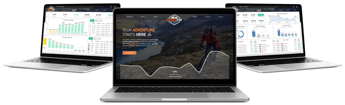
Transform your Power BI Reports into Premium, App-Like Experiences
Introducing "14 Days to Mastering Power BI UX/UI Design"
A proven, step-by-step UX/UI system that turns ordinary Power BI reports into intuitive, decision-driving experiences in just 14 days.
Follow a Proven Process: Use a repeatable 10-step Power BI UX UI design system that you can plug into every project.
Captivate Stakeholders: Design stunning, story-driven Power BI reports that hold attention and drive decisions.
Design for All Users: Craft clear, accessible, user-friendly reports that work for every type of user.
Stay Relevant in the AI Era: Differentiate yourself with a high value UI UX skill-set that protects and elevates your career.
Get Real Hands-On Experience: Build a modern Power BI report from scratch with guided, real-world implementation.
Master Advanced UX/UI Techniques: Implement professional navigation, layouts, bookmarking, and best practices with ease.
What makes this course special?
The Proven Blueprint Built Specifically for Power BI
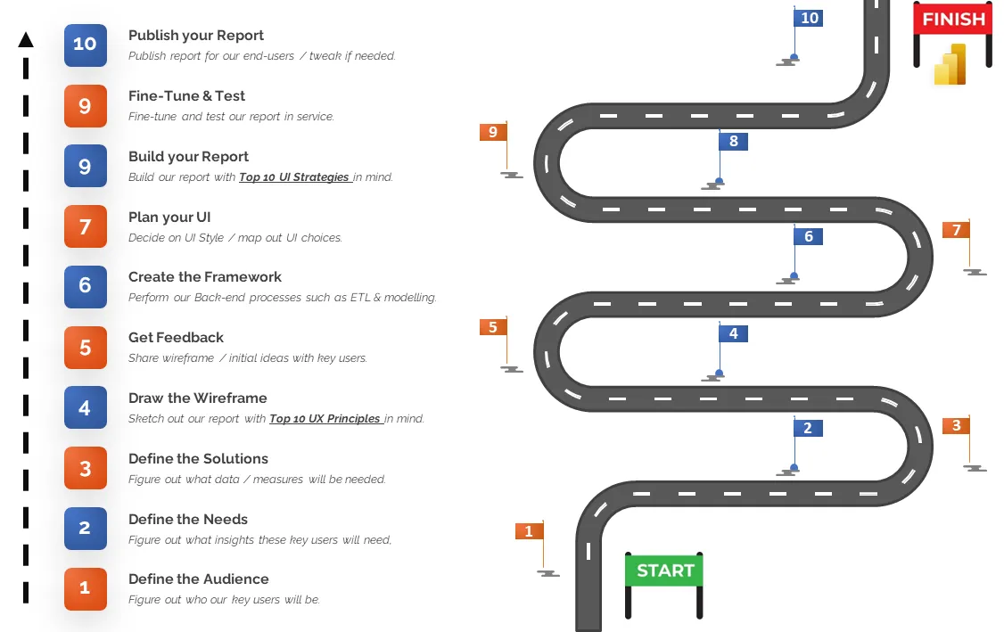
At the heart of this program is the Next Level Power BI UX/UI 10 Step Process, a streamlined and repeatable blueprint for planning, designing, and building Power BI reports that feel intuitive, modern, and easy to use.
Created specifically for Power BI developers, this UX / UI system is grounded in proven design principles and real world experience, giving you a clear path from defining your audience to publishing polished, user-friendly reports.
Instead of simply building insight-rich dashboards, you learn how to design experiences that guide users and support confident business decisions.
What you will learn in 14 Days
Here's what you are going to learn and experience in this one of a kind self-paced program designed to make you a Power BI Report Design Expert.
Days 1 -4
Phase 1 - Class Lessons - (4h 10min)
Welcome to this 4-hour, no-fluff, masterclass on Power BI UX/UI Design theory! In Phase 1, we'll dive deep into my groundbreaking Next Level Power BI UX/UI Design 10-Step workflow.
This 10 step Power BI UX/UI Design workflow was developed utilizing PROVEN UX/UI design strategies such as Gestalt psychology, Design Thinking IBCS SUCCESS rules, Don Norman’s principles, as well as techniques I have learned over the years from building UX/UI designed websites and Power BI Reports.
This proven blueprint, when followed ,will allow you design and build beautifully crafted Power BI Reports that consistently deliver an exceptional user experience...EVERY TIME.
What you'll learn in days 1-4

MASTER POWER BI UX/UI
Understand the essentials of UX/UI, discover their benefits, and learn how to elevate your Power BI reports with these principles in mind.

IDENTIFY AUDIENCES
Recognize various Power BI user types, understand their unique preferences, and tailor your reports to meet them effectively.

UNCOVER USER NEEDS
Learn how to ask the right questions to reveal the true needs of your end-users, ensuring you develop the right solutions the first time.

MAP USER SOLUTIONS
Identify the pieces needed to address the user needs within your Power B Report in the most precise, efficient, and impactful way.

CREATE WIREFRAMES
Learn various techniques on how to sketch and design your Power BI reports, setting a strong foundation for your report's success.

APPLY KEY UX PRINCIPLES
Design Power BI report UIs that are universal, simple, grouped, positioned, proportioned, balanced, consistent, familiar, spaced, and aligned

GET FEEDBACK
Implement best practices for obtaining feedback on your Wireframes, ensuring your final design meets user needs while saving you valuable time.

PLAN EFFECTIVE UI'S
Dive deep into UI design planning, from choosing the right colors and fonts to selecting impactful visuals and defining your overall style.
LEARN DATA VISUALIZATION
Discover the various types of Power BI report visuals, understand when to use each one, and learn the reasons behind these choices.

MASTER COLOR THEORY
Learn the key role of color in UX/UI, including color schemes, contrast ratios, WCAG compliance, and creating themes for colorblind users.

DISCOVER UI DESIGN
Explore the evolution of UI design so you can choose the best elements for your reports, from Flat Design to Material Design to Fluent Design.

APPLY KEY UI STRATEGIES
Build Power BI reports that are usable, clear, condensed, consistent, contextual, contrasting, variant, accented, engaging, and accessible.
You will learn the Next Level Power BI UX/UI 10 Step Process to ensure your Power BI Reports deliver an amazing User Experience.
Days 5 -12
Phase 2 - Follow Along - (9h 30min)
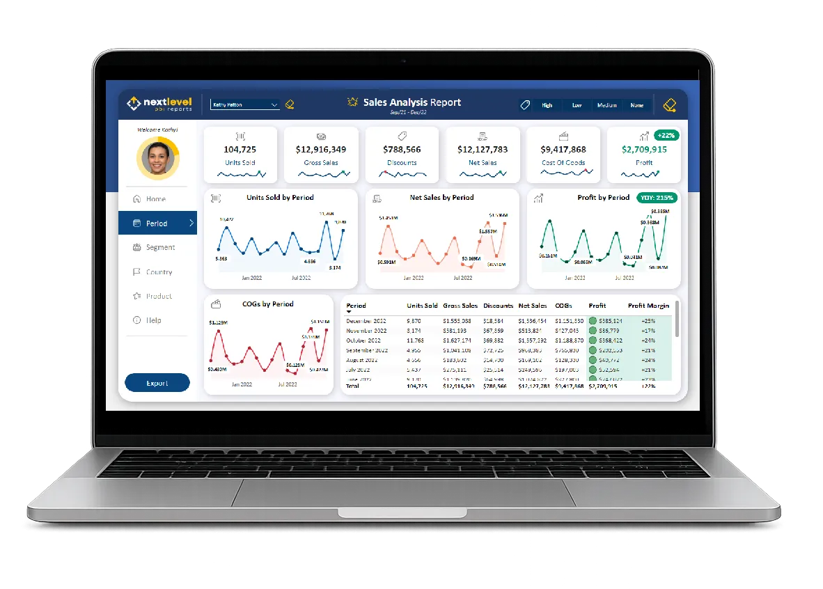
Have you ever wanted to see EXACTLY how a professional Power BI Report was created, from the backgrounds to every visual setting? In this unique project-based Power BI experience, you will follow along with me step by step as we build a modern, UX/UI designed Power BI Report from the ground up! You'll gain extensive, invaluable experience building a comprehensive UX/UI designed Power BI report.
What you'll learn in days 5-12
POWER BI UI CREATION
Build Professional Power BI reports implementing advanced UI techniques related to alignment, spacing, grouping, sizing, and more.

CUSTOM BACKGROUNDS
Learn to build modern, custom backgrounds from scratch within Microsoft Power BI, enhancing visual appeal and report element contrast.
DATA VISUALIZATION
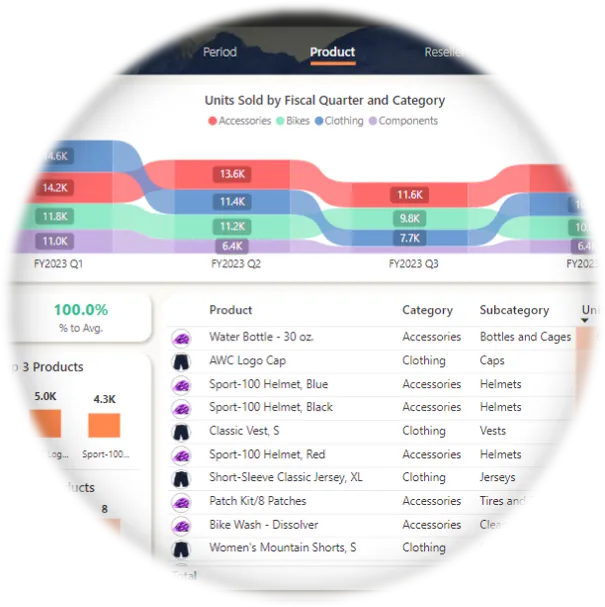
Gain expertise with a large array of visuals such as column, bar, area, line, ribbon, and donut charts, tables, sparklines, slicers, cards, and buttons
VISUAL CUSTOMIZATION
Master the art of customizing visuals within Power BI reports, ensuring they meet your specific UX/UI needs and preferences.
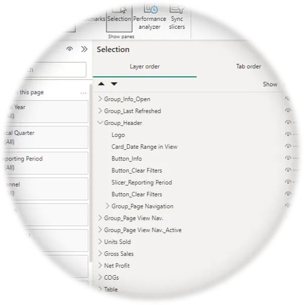
ADVANCED LAYER GROUPING
Learn best practices for naming, grouping, and re-utilizing layers, streamlining your workflow and enhancing report organization.
PRO BOOKMARKING
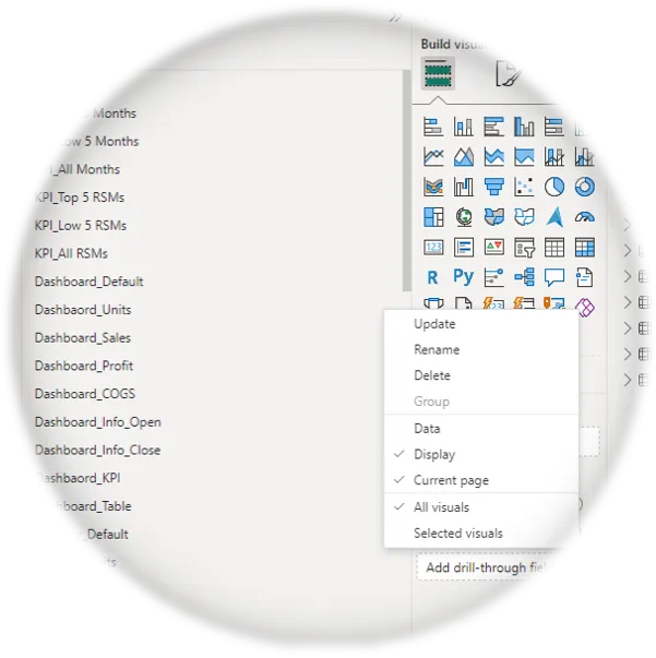
Create multiple bookmarked views within the same page and across different report pages, improving navigation and usability.
SOPHISTICATED NAVIGATION
Build advanced, user-friendly, custom navigation panes for seamless in-page and out-page navigation, enhancing report interactivity.
DYNAMIC TOOLTIPS
Design custom / contextual Power BI report tooltips that deliver valuable insights instantly, impressing and engaging your audience.
ENGAGING UI ELEMENTS
Incorporate various UI elements into Power BI reports such as Icons and Images to make them more engaging, familiar, and exciting for users.
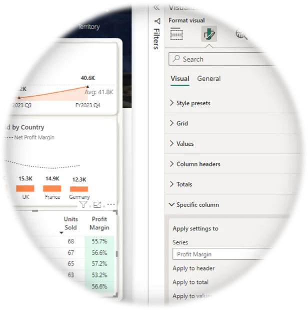
CONDITIONAL FORMATTING
Gain extensive experience with all types of Power BI conditional formatting, from icons to background colors, enhancing insight context.
SLICER IMPLEMENTATION
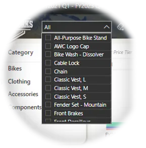
Learn how to strategically implement Power BI report slicers for improved user interaction in your reports when it makes makes sense.
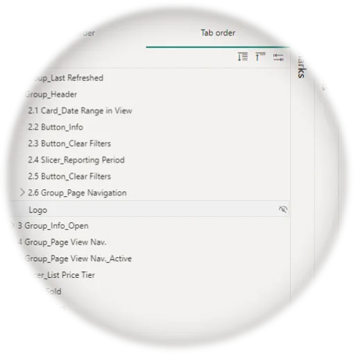
ACCESSIBILITY FEATURES
Implement Power BI accessibility features like alt text, tab orders, and color themes to ensure usability for ALL users.
Together, we'll ...
Start with a Blank Canvas: We'll begin by setting up our Power BI Report from scratch.
Create Custom Backgrounds: We'll create our report backgrounds in Microsoft PowerPoint.
Make the Home Page: We'll make the Adventure Works branded Home Page.
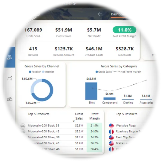
Build the Dashboard: We'll build the Executive Dashboard with six separate views, all on the same page.
Create the Operational Pages: We'll create two operational report pages, each with five distinct views, providing easy to digest insights.
Make Custom Tooltip Pages: We'll make custom Tooltips to give our users further insight context.
Build an Information Pop Up: We'll build an Informational bookmarked overlay grouping to provide key User Feedback.
Days 13 - 14
Phase 3 - Your Turn - (4h 30min est.)
In the final phase of our program, you will take the lead and complete the Adventure Works Project independently. Don't worry—you will have all the skills you need to tackle the remaining report tasks with confidence!
In Power BI, mastery comes through hands-on practice and repetition. This phase emphasizes the importance of reinforcing your knowledge through repeated application, ensuring you internalize the skills needed to effortlessly implement these strategies in your future Power BI reports.
What you'll create in days 13-14
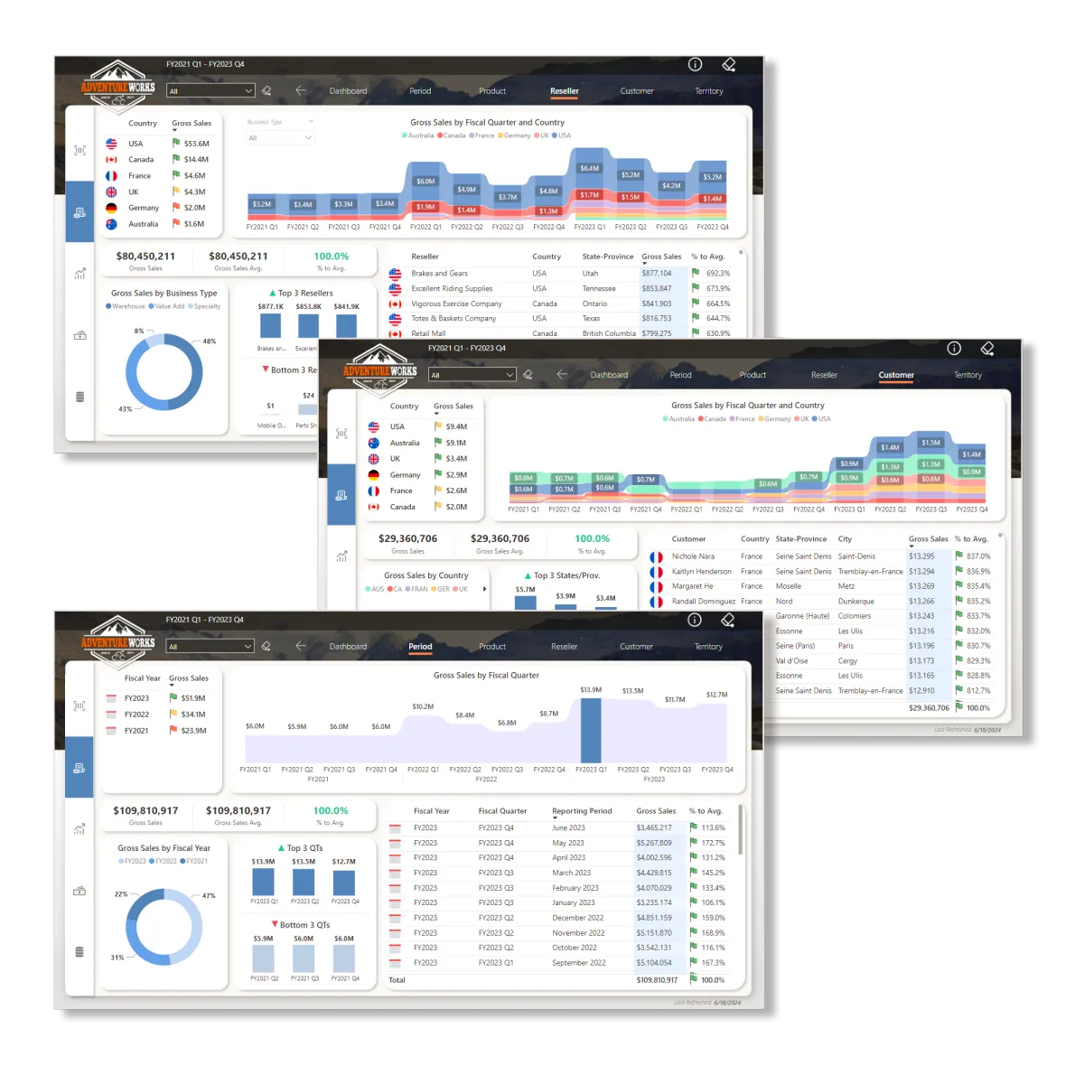
CUSTOMER, RESELLER, & PERIOD PAGES
Take charge of creating the remaining three report pages and all of the their in-page views. This hands-on experience will enhance your Power BI UX/UI report building skills, providing you with practical and invaluable expertise.
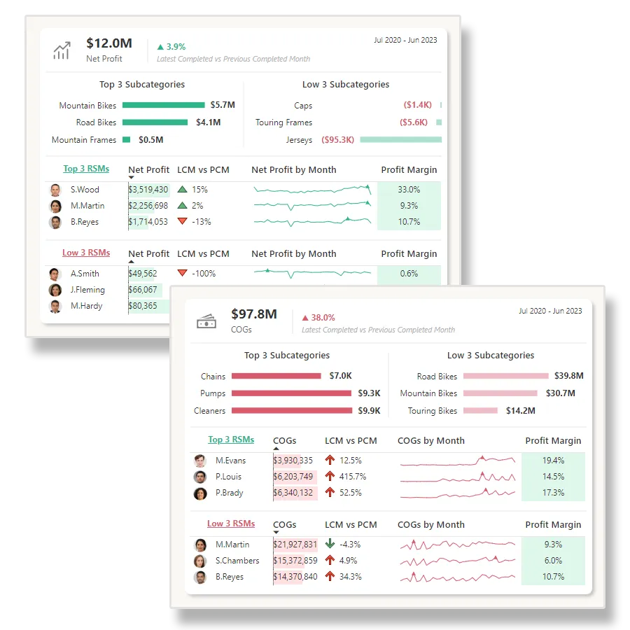
NET PROFIT & TOOLTIP PAGES
Take charge of developing the remaining two tooltip pages. This practice phase will give you essential, hands-on experience in developing advanced, custom Tooltips that you can implement on your future Power BI reports.
TESTIMONIALS
What my students are saying

" This course is very detailed and absolutely amazing. Its a one stop shop for all things Power BI design which is a key consideration in Enterprise or Self Service BI.
I would say its the highest level of design one could get to.
The best part of Gary's courses are that he has the ability to share his knowledge.
Personally I have picked up ideas from his courses and added them to my workflow.
Trust Pilot allows only 5 stars, I would give this course 5 more additional stars if I could. "
- Carlton Seymour
" The value I received from this course is immeasurable. Each video is a treasure trove of knowledge, and the instructor’s passion for Power BI is palpable and inspiring. This course is not just an educational journey; it’s a tool I will continually use in my future Power BI work.
The user experience was seamless. Registration and sign-up were straightforward. The overall quality of the course was professional. The video editing was top-notch, and I gained new insights into basic color theory and design.
I would recommend this course to anyone that is serious about leveling up their skills in Power BI."
- Brandon Brimberry

" This course is a game-changer, not only for Power BI UI/UX development but also for anyone in front-end development who wants to deepen their understanding of UI/UX principles.
My grasp of Power BI UI/UX development has significantly improved thanks to this course.
Gary's knowledge transfer is unparalleled in this subject area.
Despite being online, the course feels like a one-on-one experience with the instructor.
It's the best course I've encountered on this topic. I cant wait for your next series."
- Nana Duah

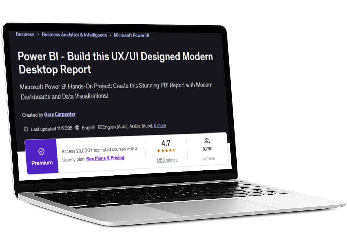
Udemy BONUS Course Included
Build a Modern Power BI UX/UI Designed Report from Scratch
Want even more real-world, hands-on experience designing modern, UX/UI-driven Power BI reports? You’ll also get my best-selling Udemy, project-based course, Build THIS PBI UI: Next Level Sales, included free with your purchase today.
This is a 7-hour, follow-along build where you work side by side with me to design and build a fully modern Power BI report from a blank canvas. You’ll see the full process unfold in real time, from data modeling and layout decisions to polished UX/UI backgrounds and a presentation-ready final report.
This course is a $99 standalone value and one of the highest-rated Power BI courses on Udemy, with a 4.7-star rating and nearly 10,000 students worldwide, included at no additional cost.
Master Advanced Report Structuring
Expert layer grouping, naming, alignment, and sizing for clean, scalable Power BI layouts.Design Intuitive Navigation Systems
Build modern navigation panes, bookmarks, and multi-view pages that feel effortless to use.Create Interactive Insight Experiences
Custom tooltips, advanced slicers, and drillthrough pages that deepen exploration and understanding.Craft Polished, Website-Level UI
Design professional headers, footers, dashboards, and backgrounds using proven web and UI principles.Elevate Visual Storytelling
Customize visuals, cards, tables, sparklines, and icons including animated elements for maximum impact.
BUILD THIS PBI UI - TESTIMONIALS
What my Udemy students are saying
I can honestly say that this course has been a game changer for me. I'm in the fairly early stages of my Power BI journey and this course has opened my eyes as to the possibilities, especially with regards to design and layout, as well as clever tips and tricks to manipulate visuals.
It has really made me feel excited about the subject and shown me that I need to think differently and creatively when designing BI tools.
Thank you Gary, getting insight and knowledge from someone with your experience is invaluable. Please make more like this, it's excellent, I'll buy them all day long.
-Duncan B.
"This course was wonderful!! I am beginning my data analyst journey and it seems like there’s a want to show you how to create complicated measures and learn intricate DAX code and get super into the weeds of the technical capabilities of Power BI.
Although that is part of the equation, the other part which is highly overlooked is the design related nuances of creating a wonderfully functional and visually appealing report.
Becoming familiar with positioning, grouping, bookmarks and using measures to dynamically change the fill were all great to get to explore...
...Thanks Gary for your calm tone and thorough instruction. I will definitely be on the lookout for more videos from you!
-Nicole R
"This is an excellent walk-through of how to create a modern-looking web application in Power BI!
Whilst I knew about a lot of the concepts shown in the course. It was good to relearn them and put them into practice.
Gary did a great job taking you through creating this report step-by-step. The report is a fantastic-looking report. It's clean and has a modern look."
-Andrew H
"I have zero experience with Power BI, and this course blew my mind and Gary offered very responsive support.
Would highly recommend this course if you are like me who is a new beginner with Power BI."
-Janie L.
" This course has everything I need to learn about Power BI design tips, tricks, and so much more!
The facilitator's pace is excellent, tone of presentation clear and easy to understand."
-Tertia S.
"Excellent course. The entire project was just beautifully curated and demonstrated by the author. So many new learnings on how to use the tool extensively with great UI features in the report.
Truly recommended for anyone who wants to go next level in learning Power BI."
-Abhinav R
"Very detailed descriptions.
Update:After finishing the course, I felt like I had to update my rating. This course is a clear 5/5.
Very good and I learned a ton! Hopefully Gary creates more similar courses on Udemy."
-Per L.
" I would give this course a 10 star rating if it were possible. This is definitely not a course for beginners, so please beware. This is also not a course on DAX and Data Modelling.
This is a course on Data Design and Gary takes it to a level that is way way above the others in this part of the Power BI eco system.
I will be using many of his techniques in an almost identical use case that I am working on. Could not have come at a better time.
Thank You again Gary. This is a WOW class.
-Carlton S.
"The course is well-structured and balanced. The use case presented has an appropriate level of difficulty, and the teacher guides you through all the steps to help you understand how to navigate the UI and manage the components.
The repetitive exercises also help reinforce the concepts that might otherwise be forgotten if done only once."
-Gabriele Nunzio M.
"By far the best Power BI tutorial I have come across. Gary has been a great instructor for this Course."
-Viraj P.
"Great course ! This course has shown me some advance features and how to use them..
Thank you for such an amazing course :) "
-Erik K.
"Wow. A stunning job of tools and process for manipulating Power BI Dashboards. The PowerPoint layout process is pure Gold."
-James S

Access My YouTube DEMO Files
Unlock my YouTube Demo File Library
When you upgrade to the Pro or Premium plan, you unlock access to every completed YouTube demo file from the Next Level Power BI Reports YouTube channel.
Follow along with the tutorials using the exact finished Power BI files, giving you full visibility into every setting, interaction, and UX/UI decision demonstrated in each video.
This library continues to grow over time, and as new files are added, pricing increases. Lock in access at today’s price by upgrading now. You’ll receive all future YouTube demo files automatically as new content is released.

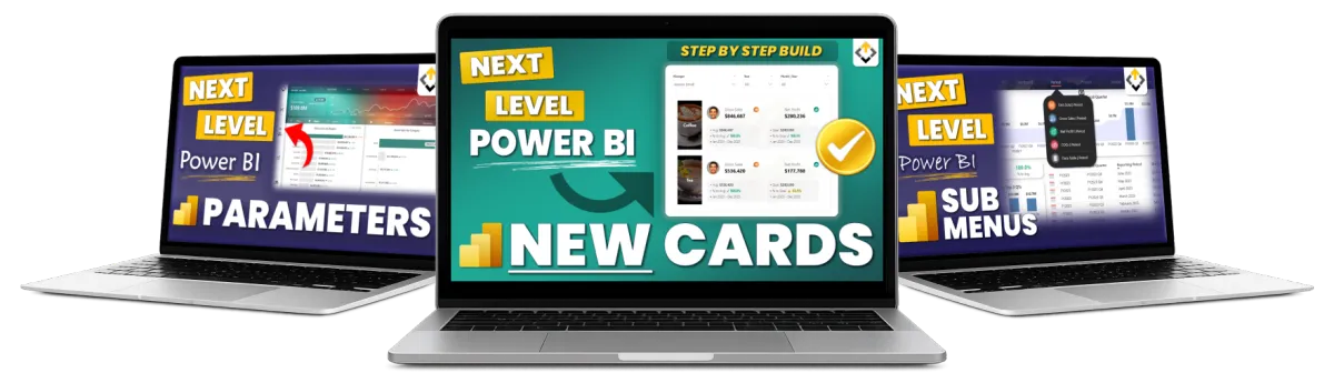
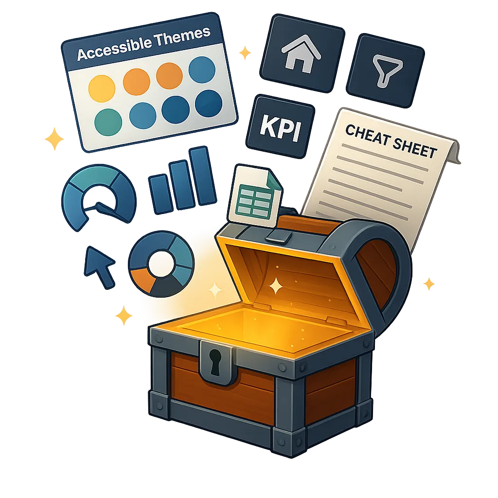
10 Game Changing Power BI Assets
Unlock my Next Level Power BI UX/UI Toolkit
When you upgrade to the Premium plan, you unlock access to the Next Level Power BI UX/UI Design Toolkit.
Enjoy a complete suite of custom, pro-grade Power BI assets designed to help you craft beautiful, professional dashboards in a fraction of the time. It's the essential UX/UI companion cheat-code to impress stakeholders faster than ever!
From backgrounds and themes to icons, datasets, and complete design frameworks — this toolkit packs 10 pro-grade assets that cover every angle of stunning, user-friendly Power BI report design.
Learn More about what this Power BI Asset Pack includes HERE.
Build faster. Design smarter. Impress every time.
Save Hours Instantly: Templates, themes, and assets that cut design time from hours to minutes.
Create Stunning Dashboards: Modern, UX/UI-built designs that look like top consulting work.
Focus on Insights: Stop tweaking colors and layouts, and spend more time delivering impact.
Never Start From Scratch Again: Always have pro-grade starting points ready to drop in.
Stand Out as the Expert: Impress stakeholders and set yourself apart in the vast Power BI world.
Build a World-Class Portfolio: Everything you need to build Next Level Power BI Reports FAST to showcase within your Portfolio.
Lifetime Membership Plans
Hate Subscriptions? Me too! Choose the Lifetime Plan that's right for you.

PRIMARY
Get the Course!
14 Days to Mastering Power BI UX/UI Design
Next Level Power Bi Community Membership
Power BI UX/UI Design Cheatsheet
Colorblind-Friendly, Modern Themes
Future Updates Included
BONUS: Udemy Course Included
1 Time Payment USD

PRO
Get the Course & Bonuses!
14 Days to Mastering Power BI UX/UI Design
Next Level Power Bi Community Membership
Power BI UX/UI Design Cheatsheet
Colorblind-Friendly, Modern Themes
Future Updates Included
BONUS: Udemy Course Included
YouTube Completed Demo Files Included
1 Time Payment USD

PREMIUM
Get the Course, Bonuses, and Toolkit!
14 Days to Mastering Power BI UX/UI Design
Next Level Power Bi Community Membership
Power BI UX/UI Design Cheatsheet
Colorblind-Friendly, Modern Themes
Future Updates Included
BONUS: Udemy Course Included
YouTube Completed Demo Files Included
Next Level Power BI UX/UI Design TOOLKIT
1 Time Payment USD
ABOUT YOUR INSTRUCTOR
Meet Gary Carpenter
Gary is a Power BI UX UI design expert, EdTech entrepreneur, and founder of Next Level Reports LLC. He is the creator of the flagship program 14 Days to Mastering Power BI UX UI Design, trusted by professionals around the world to build modern, intuitive, executive-ready Power BI reports.
He began teaching on Udemy, where his first course, Build THIS UX UI Designed Modern Desktop Report, reached nearly 10,000 students and earned a 4.7 rating as of 2026, ranking among the highest-rated Power BI UX UI courses on the platform.
With nearly 20 years of experience in the CPG industry, Gary has served as a senior data analyst for a global sales and marketing company, delivering UX UI driven Power BI solutions for billion-dollar brands. He also brings 15 years of experience as a web designer and developer, applying proven UX UI and conversion principles across analytics and digital products.
Through Next Level Reports, Gary helps professionals and organizations transform complex data into clear, accessible, and high-impact reporting experiences.

WHO IS THIS FOR
If you're looking to enhance your Power BI Report Design Skills to create more effective and engaging reports for your end-users, then this course is for you.
Data Analysts
POWER BI DEVELOPERS
BUSINESS INTELLIGENCE PROFESSIONALS
DATA VISUALIZATION SPECIALISTs
POWER BI FREELANCE DEVELOPERS
POWER BI STUDENTS
POWER BI PROJECT MANAGERS
POWER BI IT PROFESSIONALS
Business Analysts
Financial analysts
data scientists
anyone who creates power bi reports
STILL NOT SURE?
Satisfaction Guaranteed
I want you to find value in the program! I offer full refunds within 7 days. With all of this valuable video training, I am confident you WILL love it!

STILL HAVE QUESTIONS?
Frequently Asked Questions
Is this course for Power BI beginners?
I recommend having already taken a "general" Power BI course, or already having at least 6 months of experience prior. That being said, it's not required. If you are an absolute beginner, you will be able to complete this course.
Does this course teach DAX?
No, This Power BI Program is focused on teaching you how to design Power BI reports that give an amazing user experience. The focus is on the front-end - not the back-end.
Are the completed source files for the follow-along projects included?
Yes, after 7 days from your enrollment date the completed source files will become unlocked for you to access.
If I have questions, what do I do?
Please post your questions in the community group! I will get back to you as soon as possible.
Enroll Today!
© Next Level Reports LLC - All Rights Reserved | Privacy Policy | Terms & Conditions