
👉 “Finally, a toolkit built for Power BI Designers to give them their time back.”
Next Level Power BI UX/UI TOOLKIT
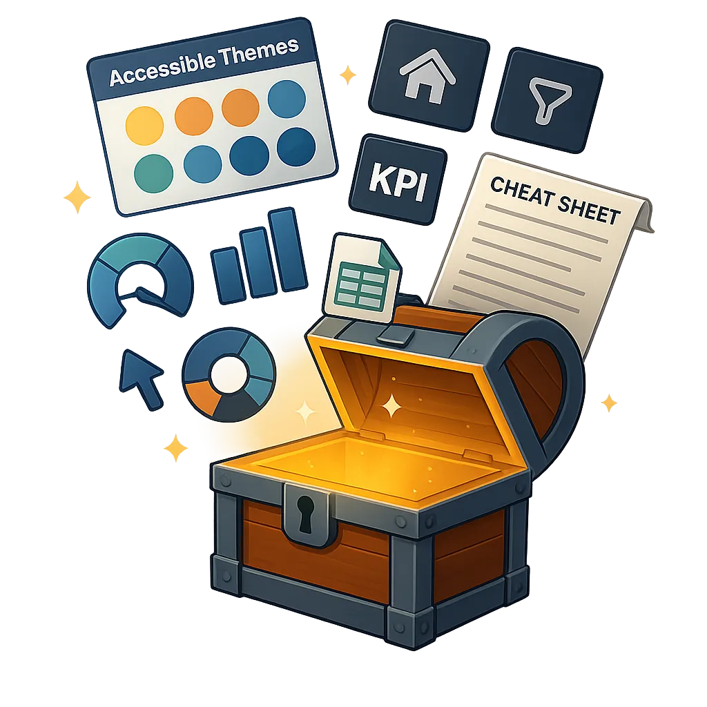
🧰 A complete suite of custom, pro-grade Power BI assets designed to help you craft beautiful, professional dashboards in a fraction of the time. The essential UX/UI companion cheat-code to impress stakeholders faster than ever! ⚡
VIDEO COMING SOON!

⭐⭐⭐⭐⭐
It's a Must Have!
This Power BI Toolkit has made a huge impact on how I approach reporting and analysis! It’s a must-have for anyone serious about data storytelling!
- Daniel McClure - Sales Analyst
Do your Power BI Dashboards take forever ⏱️ to build?
- and still aren't getting those "Wows"?

If this feels familiar, you’re not alone — and the solution is finally here.
🚫 Spending countless hours building dashboards from scratch only to feel like they still don’t look polished or professional?
🚫 Wasting time fixing colors, layouts, and formatting when you’d rather be focused on insights and storytelling?
🚫 Reports technically “work” but fail to engage stakeholders, leaving you frustrated because the design doesn’t reflect the quality of your analysis?
🚫 Struggling to balance speed with design quality, where each project becomes a tug-of-war between deadlines and creating something visually impressive?
🚫 Feeling stuck without a clear blueprint or design system, with every new report build feeling like you're reinventing the wheel?
Introducing...
The Next Level Power BI UX/UI TOOLKIT 🧰
Build Stunning Power BI Reports in a fraction of the time.
Save Hours Instantly: Templates, themes, and assets that cut design time from hours to minutes.
Create Stunning Dashboards: Modern, UX/UI-built designs that look like top consulting work.
Focus on Insights: Stop tweaking colors and layouts, and spend more time delivering impact.
Never Start From Scratch Again: Always have pro-grade starting points ready to drop in.
Stand Out as the Expert: Impress stakeholders and set yourself apart in the vast Power BI world.
Build a World-Class Portfolio: Everything you need to build Next Level Power BI Reports FAST to showcase within your Portfolio.
Build faster. Design smarter. Impress every stakeholder, every time.
Here’s What’s Inside Your Power BI UX/UI Toolkit 👇
From backgrounds and themes to icons, datasets, and complete design frameworks — this toolkit packs 10 pro-grade assets that cover every angle of stunning, user-friendly Power BI report design.
🖼️ BACKGROUND TEMPLATES
35 customizable Power BI backgrounds to build modern, professional reports fast.

🎨 ACCESSIBLE COLOR SCHEMES
25 colorblind-friendly palettes that keep dashboards clear, modern, and inclusive.
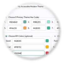
🎛️ JSON THEME GENERATOR
Create polished Power BI JSON themes in seconds with this Windows app.
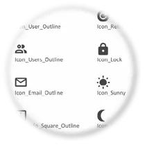
❤️ SVG BUSINESS ICON PACK
88 x 5 scalable SVG icons at your fingertips for fast report design integration.
📖 EMOJI & SYMBOL LIBRARY
278 curated emojis and symbols to add clarity, impact, and engagement instantly.
🧠 POWER BI DATASETS & AI
10 pre-made datasets plus 6 AI prompts to practice, and build dashboards fast.
🎯 KPI VISUAL EXAMPLES
12 modern KPI visuals with DAX measures and formatting to mirror within your reports.
🧩 BUTTON TEMPLATE PACK
18 pre-built navigation and button slicer layouts to use with light and dark modes.

🧭 PBI UX/UI 10 STEP PROCESS
A proven, repeatable 10-step framework with a quick-reference cheatsheet included.
⭐ TOP 10 PBI UX/UI RESOURCE LIST
Top 10 list of the best UX/UI books, courses, and guides to sharpen your design skills.
💡 Why spend countless hours designing from scratch when you can unlock 10 pro-grade assets built to save time and impress instantly?
With 35 backgrounds, 25 accessible color schemes, 440 custom SVG icons, 278 curated emojis, pre-modeled datasets, and more, this toolkit gives you everything you need to deliver dashboards that are modern, polished, and stakeholder-approved.
👉 Build faster. Design smarter. Impress every time.
10 Game Changing Power BI Assets Inside
Unlock the full power of your Pro-grade, Next Level Power BI UX/UI Toolkit 🔑
1. 🖼️ Power BI Pro Background Template Pack -(35 Backgrounds)
Never start from a blank canvas again. These backgrounds give you a professional foundation instantly so you can build faster, design smarter, and impress every stakeholder.
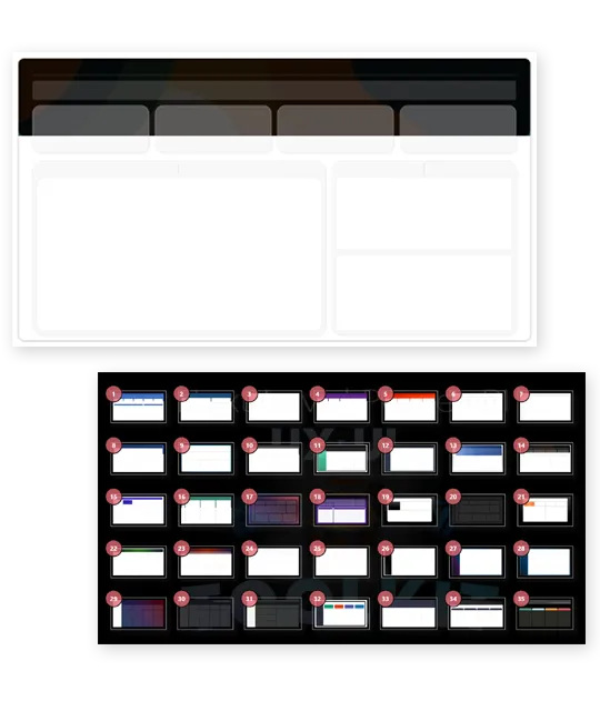
✅ 35 Professionally Designed Templates – Every background is crafted in full HD 1920×1080 for sharp, flawless layouts in any 16:9 report.
✅ Instantly Usable in Power BI – Comes with a ready-to-go PBIX file (plus dataset) preloaded with all 35 templates. Just open, swap, and start building.
✅ Fully Customizable – Edit shapes, colors, and layouts in PowerPoint to perfectly match your brand or make quick adjustments.
✅ Dark Mode + Light Mode Ready – Switch seamlessly between modern light or sleek dark designs to fit any audience or environment.
✅ Covers Every Navigation Style – Side menus, top bars, KPI-focused layouts, minimalist dashboards, and more. Every design style at your fingertips.
✅ Massive Time Saver – Forget hours of setup. Drop in a background, connect your data, and deliver professional, client-ready dashboards in minutes.
✨ Bottom line: No more wasted hours. With 35 plug-and-play layouts, you’ll create modern, UX/UI-perfect dashboards that look like they came from a top-tier consulting firm.
2. 🎨 Colorblind Friendly Power BI Color Schemes - (25 Themes)
Build dashboards that are inclusive, modern, and polished — without the endless trial and error. These curated, accessibility-validated palettes ensure your reports look stunning and stay clear for every user.
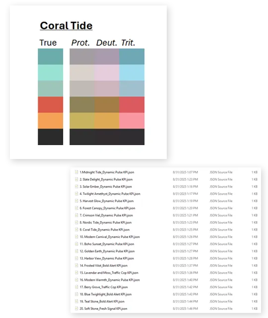
✅ Accessibility-Validated – Tested against Deuteranopia, Protanopia, and Tritanopia simulations so your insights stay clear and readable.
✅ Dual Format Ready – Delivered in Excel (with HEX codes and previews) and JSON for instant use in Power BI or your design workflow.
✅ 25 Ready-to-Use Themes – Includes 20 full JSON themes plus 5 KPI-focused color sets (3-color variations) designed to clearly highlight good, neutral, and bad performance.
✅ Modern & Professional Look – Built with proven color theory, giving you vibrant, business-ready palettes that stay consistent across reports.
✅ Bonus Resources Included – Extra resources to generate palettes, check contrast ratios, and capture HEX codes with ease.
✅ Stand Out Instantly – Most themes online ignore accessibility. Yours will be polished, inclusive, and trusted by all stakeholders.
✅ Save Hours of Guesswork – No more clashing colors or trial and error. Apply a theme and deliver stunning dashboards in minutes.
✨ Bottom line: Professional, accessible, and effortless — 25 pre-built themes that prove your color schemes are Next Level.
3. 🎛️Power BI JSON Theme Generator - (Windows App)
Stop wasting time hand-coding JSON themes. This desktop app gives Power BI developers a fast, frustration-free way to build professional, brand-consistent themes in just a few clicks.
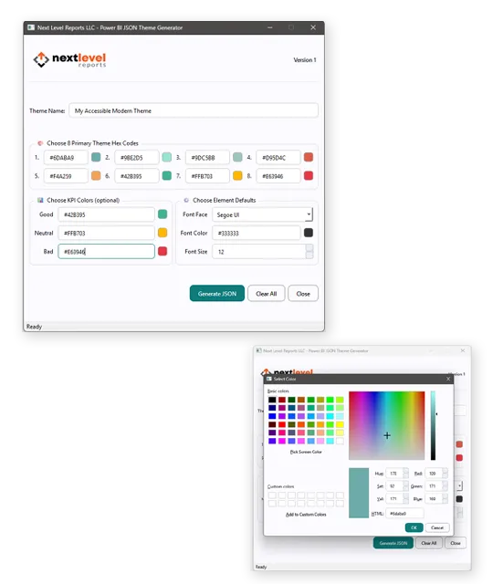
✅ Instant JSON Creation – Input up to 8 primary colors plus 3 KPI colors, set your global font face, size, and text color, then generate a ready-to-use JSON file instantly.
✅ Click-to-Choose Colors – No hex codes memorized? Just click into the swatch, pick visually, and the tool formats everything automatically.
✅ Complete Design Control – Apply consistent, on-brand colors and fonts at the global level for a professional, unified report design.
✅ Seamless Power BI Integration – Load your generated JSON straight into Power BI and instantly apply your theme across all visuals, slicers, and KPIs.
✅ Massive Time Saver – Eliminate the trial-and-error of coding JSON by hand. Build themes in under a minute that normally take hours.
✅ Professional Results, Effortlessly – Deliver dashboards that are modern, polished, and on-brand themed - easily and quickly.
✨ Bottom line: Generate stunning, custom Power BI themes fast — skip the code, keep the polish.
4. ❤️ SVG Icon Pack - (88 x 5 variations)
Icons are the fastest way to make your reports feel polished, professional, and designed with intention. Yet most developers ignore them — or waste hours hunting, downloading, and formatting generic packs that never quite fit. This curated library changes that.
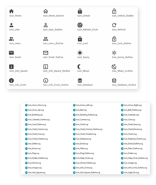
✅ 440 Power BI-Ready Icons – 88 unique business/reporting icons (Home, User, KPI, Filters, Charts, Databases, Social Media, and more) × 5 variations (Black, Gray, White, Off-White, Blue). Every style you need, instantly.
✅ Crisp & Scalable SVG Format – 100% vector-based icons that look flawless at any size inside buttons, slicers, or reports.
✅ Organized & Renamed for Speed – Each file is clearly labeled (Icon_Home, Icon_User, etc.), so you can find and drop in the exact icon you need without wasting time.
✅ Copy-and-Paste Power BI File – A 5-page PBIX with every icon preloaded as blank buttons, letting you grab and paste icons directly into your dashboards.
✅ Quick Reference PDFs & PowerPoint File – Instantly preview the entire collection or copy icons into your slides for stakeholder presentations.
✅ Seamless Light & Dark Mode Support – Variations optimized for any theme, ensuring icons always stand out cleanly.
✅ Instant Professional Polish – Go from “basic” visuals to sleek, business-ready dashboards that impress stakeholders on sight.
✨ Bottom line: Stop wasting hours hunting for icons. This pack gives you a complete, Power BI-optimized library that instantly elevates every dashboard.
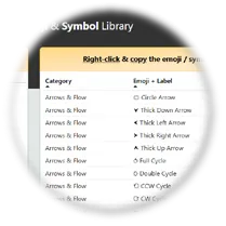
5. 📖 Emoji & Symbol Library - (278 Across 20 Categories)
Emojis and symbols aren’t decoration — they’re shortcuts to clarity. This curated library gives you 278 business-focused options to guide attention, emphasize meaning, and make dashboards instantly more contextual and engaging.
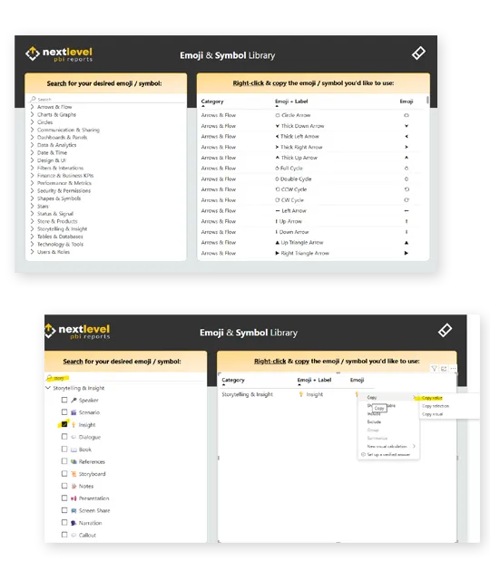
✅ 278 Curated Emojis & Symbols – Business-relevant and carefully chosen across 20 categories: Arrows & Flow, Charts & Graphs, Data & Analytics, Finance & KPIs, Storytelling & Insight, and more.
✅ Searchable Power BI Report – A ready-to-use PBIX file where you can browse categories or search instantly, then copy and paste symbols directly into your dashboards.
✅ Three Flexible Formats – Delivered in Power BI, Excel, and Notepad so you can pull emojis and symbols into your workflow however you prefer.
✅ Optimized for Reporting – Every symbol was handpicked for KPIs, dashboards, and storytelling — no clutter, only practical, business-focused options.
✅ Enhance Communication Instantly – Add arrows, stars, signals, and status markers that make your insights easier to understand at a glance through visual context, which aids in accessibility.
✅ Save Hours of Searching – Stop wasting time on inconsistent emoji websites. This pack is already curated, organized, and presentation-ready.
✨ Bottom line: Sharper dashboards, faster communication, zero wasted time — your personal library of 278 business-focused emojis and symbols.
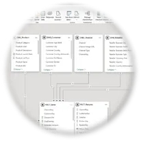
6. 🧠 Power BI Datasets - (10 Custom Datasets & 6 AI Prompts)
Realistic, ready-to-use data is one of the hardest things to find — and the most essential for practicing and building in Power BI. This pack solves that instantly with 10 pre-modeled datasets plus AI prompts to generate unlimited new ones.
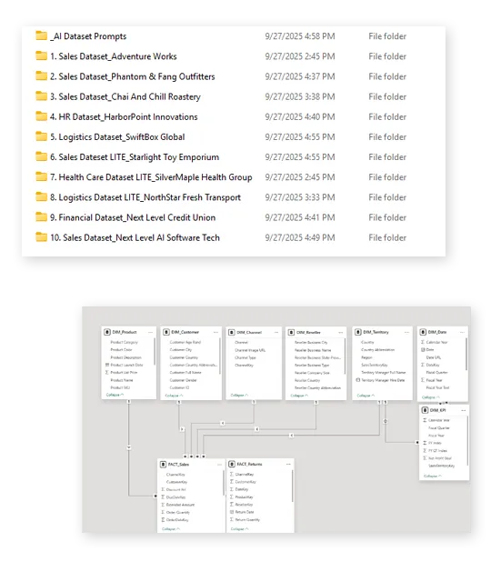
Sample Dataset Collection
✅ 10 Full Datasets – Covering Sales, HR, Logistics, Finance, and Healthcare, plus AdventureWorks.
✅ Clean Excel Workbooks – One table per tab, properly named and formatted.
✅ Pre-Built PBIX Files – Datasets already loaded and modeled for immediate use.
✅ Lifelike Scenarios – Includes KPIs, seasonality, promotions, cancellations, and workforce changes.
✅ Save Days of Work – Skip messy CSVs and dummy data. Start building instantly.
Custom AI Dataset Prompts
✅ 6 Expert Prompts – For Sales, Logistics, HR, plus Lite versions.
✅ Star Schema Output – Generates clean Fact and Dimension tables.
✅ Rich Business Logic – Seasonality, KPIs, trends, and cancellations built in.
✅ Unlimited Creation – Generate as many datasets as you need - ChatGPT Plus tested.
✨ Bottom line: Clean, realistic, and ready-to-use data — finally, a complete dataset pack for building and practicing in Power BI.
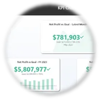
7. 🎯 Power BI KPI Visual Examples - (12 KPI Visuals with Measures)
Stop wasting hours experimenting with KPI visuals. This pack delivers 6 pre-built report pages of modern, UX/UI-designed KPI templates — each complete with DAX measures, contextual formatting, and accessibility features.
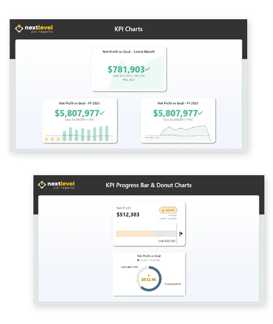
✅ 6 Report Pages of KPI Visuals – Includes columns, lines, gauges, donuts, progress bars, enhanced KPI visuals, and tables.
✅ Context-Driven Design – Goal lines, error bands, shading, and conditional formatting for instant clarity.
✅ Enhanced KPI Visuals – Standard KPIs reimagined with bar/line combos and accessibility icons.
✅ Pre-Built Widgets – Gauges, bars, and donuts powered by DAX % to Goal and contextual logic.
✅ KPI Table – A clean tabular layout surfacing goals, actuals, and progress with conditional formatting.
✅ Hands-On Learning Tool – Explore my formatting and settings, then adapt them to your own data.
✅ Time-Saver & Inspiration – Use as wireframes or finished visuals for a polished, modern look in minutes.
✨ Bottom line: Professional-quality KPI visuals, measures, and formatting — ready to learn from, adapt, and drop straight into your reports.
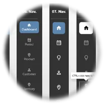
8. 🧩 Power BI Button Template Pack - (Navigation & Slicer)
Stop rebuilding navigation from scratch. This pack gives you ready-to-use button templates styled with modern UX/UI design, so you can add professional navigation in seconds.
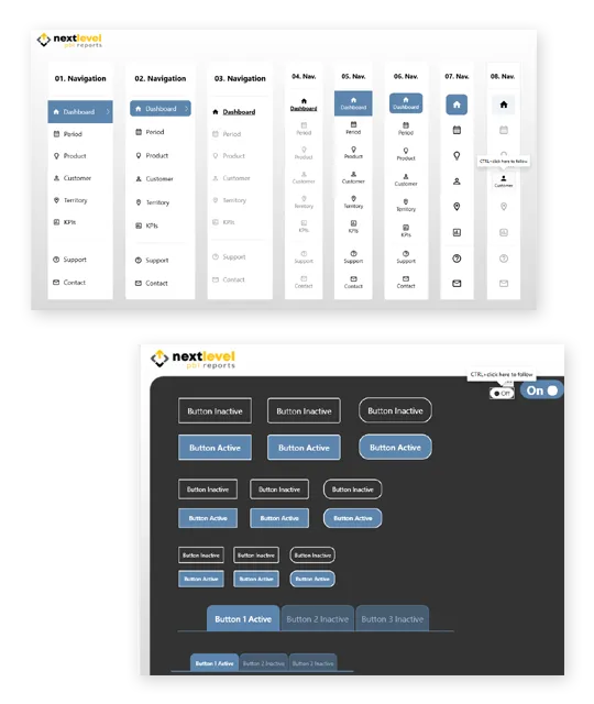
✅ Two Full PBIX Files – Light and Dark Mode versions with sample data and working bookmarks.
✅ 18 Navigation Pane Variations – Icon-only, text + icon, vertical, horizontal, and tabbed layouts.
✅ Built-In Hover Effects – Subtle contrast and hover states for polished, intuitive navigation.
✅ On/Off Toggle Buttons – Prebuilt switches that pair with bookmarks to show/hide elements.
✅ Custom Slicer Templates – Ready-made radio, multi-select, and toggle slicers to adapt instantly.
✅ Time-Saving Shortcuts – Resize, delete, or copy groups without rebuilding from scratch.
✅ Wireframing + Final Use – Perfect for prototyping layouts or dropping directly into production dashboards.
✅ Modern UX/UI Look – Every button crafted for a clean, professional style stakeholders will trust.
✨ Bottom line: Ready-made navigation and slicers that save hours and give your reports a modern, intuitive feel.
9. 🧭 Next Level Power BI UX/UI 10 Step Process - (Guide & Cheatsheet)
Great reports aren’t built by chance — they follow a proven, repeatable process. This framework combines real-world experience with established UX/UI principles to give you a clear blueprint for creating dashboards that consistently deliver Next Level results.

✅ 10 Step Framework – A clear roadmap from defining your audience to publishing polished reports.
✅ Proven Principles – Built on Gestalt psychology, design thinking, IBCS SUCCESS, Don Norman, and real-world practice.
✅ One-Page Cheatsheet – Quick-reference guide so you stay on track and never miss a critical step.
✅ Removes Guesswork – Follow a structured process instead of wondering what to do next.
✅ Blueprint for Any Report – Works across industries, use cases, and audiences.
✅ Professional Results – Create dashboards that are consistent, modern, and trusted.
✨ Bottom line: A practical, battle-tested process that takes the mystery out of UX/UI and gives you a proven path to build reports stakeholders will love.
10. ⭐ Power BI UX/UI Educational Resources - (Top 10 Guide)
UX/UI mastery isn’t just about templates — it’s about developing the right mindset and continuously learning. This curated guide gives you the 10 most impactful resources every Power BI designer should know.
✅ 10 Curated Resources – A hand-picked mix of books, courses, and websites covering UX, UI, accessibility, and storytelling.
✅ Tailored for Power BI – Each resource was chosen for its direct application to creating cleaner, more user-friendly dashboards.
✅ Key Takeaways Summarized – Each entry highlights exactly why it matters and how to apply it in practice.
✅ Covers All the Essentials – From foundational principles to modern AI-enhanced design practices.
✅ Save Months of Research – The most relevant, highest-value resources are already filtered and summarized for you.
✅ Future-Proof Your Skills – Use this guide as your personal roadmap for continuous growth and staying ahead.
✨ Bottom line: A shortcut to the most valuable learning resources, so you keep growing as a Power BI designer without wasting time searching.
Get your Power BI UX/UI TOOLKIT for only:
$900 $150
TESTIMONIALS
What my customers are saying...

" This Power BI Toolkit has made a huge impact on how I approach reporting and analysis. It's ease of use make it incredibly efficient to work with.
I especially appreciate the ability to practice with real datasets, which has helped me sharpen my skills and apply new techniques with confidence. It’s a must-have for anyone serious about data storytelling!"
- Daniel McClure
"This is a full Power BI design library tailored for creators who want to go beyond the basics. By itself it equips users with high-quality templates, themes, and visual elements, which is great, but pairing it with the course takes it from just tools to a guided system for applying those tools effectively. The $200 Bundle is a no-brainer investment!"
- Matthew Braun

" This Toolkit is the perfect complement to the 14 Days to Mastering PBI UX/UI Design course. The background templates prove you don’t need Figma to create professional designs, the icon & emoji packs are incredibly useful, and the 10-step process guide brings everything together into a clear, powerful roadmap for Power BI developers!”
- Paul Wyatt

⭐EXCLUSIVE BUNDLE OFFER⭐
For a limited time, save $70 when you bundle!
Here's what you get:
Everything Included in the Next Level Power BI UX/UI TOOLKIT.
14 Days to Mastering Power BI UX/UI Design Course – 100+ lessons, 15+ hours of content, and all project files (dataset, icons, JSON, images, backgrounds, source file).
BONUS Course: Build THIS Report – My best-selling Udemy course (6.5 hrs) with a full follow-along project + source file.
YouTube Demo Files – Download the completed files from my “Next Level Power BI Reports” tutorials.
UX/UI Design Cheat Sheet – A printable quick-reference for report design steps and principles.
Pre-Made Colorblind Themes – Modern, accessible Power BI themes ready to drop into reports.
Instant Lifetime Access – One-time purchase, forever access.
Private Community Access – Join the Next Level Power BI group for support and networking.
Future Updates Included – Get all future video lessons and resources, free.
🔥 Best Value / Most Popular
Today Just:
$200 USD (85% off) $1380
No-Brainer Investment!
"The toolkit by itself equips users with high-quality templates, themes, and visual elements, which is great, but pairing it with the course takes it from just tools to a guided system for applying those tools effectively. The $200 Bundle is a no-brainer investment!!"
Here's what you get:
35 Pro Background Templates – Instantly usable layouts that save you hours of report setup.
25 Accessible Color Schemes – Modern, colorblind-friendly palettes for clarity and trust.
88×5 SVG Business Icons – Scalable, professional icons pre-labeled and ready to drop in.
278 Curated Emojis & Symbols – Add clarity, emphasis, and engagement instantly.
10 Professionally Modeled Datasets + 6 AI Prompts – Practice, prototype, and build real dashboards fast.
12 Pre-Built KPI Visual Examples – Polished templates with DAX measures and formatting.
18 Navigation & Slicer Button Templates – Light + dark mode menus and slicers ready to go.
Power BI JSON Theme Generator (Windows App) – Build polished JSON themes in seconds.
UX/UI 10 Step Process Guide & Cheatsheet – A proven framework for stunning reports every time.
Top 10 UX/UI Resource List – The best books, courses, and guides to keep you sharp.
FREE Future Updates - When I add more to the Toolkit, you receive those updates for free, even if the price has went up.
Today Just:
$150 USD (83% off) $900
"It's a must-have!"
"This Power BI Toolkit has made a huge impact on how I approach reporting and analysis. It's ease of use make it incredibly efficient to work with. It’s a must-have for anyone serious about data storytelling!"
ABOUT YOUR INSTRUCTOR
Meet Gary
Gary Carpenter is a successful EdTech entrepreneur and best-selling Power BI UX/UI Design instructor. His course, "Build THIS UX/UI Designed Modern Desktop Report," boasts almost 5,000 students and a 4.7 overall rating (as of 7/6/24), making it one of the highest-rated Power BI courses on Udemy.
With nearly 20 years of experience in the CPG industry, Gary has served as a senior data analyst for a global sales and marketing company, delivering result-driven UX/UI designed Power BI report solutions for billion-dollar CPG companies. His innovative BI solutions have consistently led to improved decision-making processes for top clients.
In addition to his corporate experience, Gary is an accomplished entrepreneur with 15 years as a successful freelance web designer and developer. He has created modern UX/UI designed websites for numerous clients, significantly enhancing user engagement and CTA's.
In 2023, Gary founded Next Level Reports LLC with the mission to teach and inspire professionals to incorporate advanced and proven UX/UI strategies and techniques into their presentations and reports. He is passionate about helping others advance their careers and skills by transforming their data into result-driven stories that are compelling, impactful, beautiful, accessible, and user-centered focused.

WHO IS THIS FOR...
If you're looking to stop wasting hours designing stunning Power BI Reports from scratch so you can cut your build times in half, then this toolkit is for you.
Data Analysts
POWER BI DEVELOPERS
BUSINESS INTELLIGENCE PROFESSIONALS
DATA VISUALIZATION SPECIALISTs
POWER BI FREELANCE DEVELOPERS
POWER BI STUDENTS
POWER BI PROJECT MANAGERS
POWER BI IT PROFESSIONALS
Business Analysts
Financial analysts
data scientists
anyone who creates power bi reports
STILL have QUESTIONS?
Frequently Asked Questions
Do you offer a refund?
* The Next Level Power BI UX/UI Toolkit is a 100 percent digital, instantly accessible product. Due to the nature of digital downloads, all sales are final and non-refundable. if you have questions or issues with the product, please email [email protected]
*The 14 Days to Mastering Power BI UX/UI Design course includes a 7-day money-back guarantee. If a refund is requested within the 7-day window for a Bundle purchase, the refund amount will be the Bundle price paid minus the current standalone price of the Toolkit, as the Toolkit portion is non-refundable once delivered and accessed.
Where can I learn more about your course "14 Days to Mastering Power BI UX/UI Design"?
To learn more, you can visit -> https://courses.nextlevelreports.com/14-days-to-mastering-power-bi-ux-ui-design
Do you guarantee your AI Prompts will work 100%?
*The included AI prompts are provided as guidance and may produce varying results depending on how they are used. Because I have no control over third party AI platforms such as ChatGPT, their models, updates, accuracy, functionality, or availability, I cannot guarantee that the prompts will always work as intended for every user. Results may differ based on the AI model used, platform version, user inputs, settings, and internet connectivity. These prompts were originally created and tested using ChatGPT 5 (Plus plan).
© Next Level Reports LLC - All Rights Reserved | Privacy Policy | Terms & Conditions | Toolkit License Terms & Conditions